![]()
REUNITED
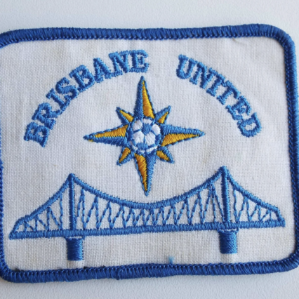
The Brisbane United FC logo begins our celebration of the city’s football heritage and history.
Its soul and key elements are a tribute to the original incarnation of 1991, including the compass point star, the city’s traditional colours and of course Brisbane’s iconic Story Bridge.
Blue and amber – the colours of the City of Brisbane – feature prominently along with white. The same colours will be evident in the team’s playing strip.
1991 is the year the first incarnation of Brisbane United was formed. We simply could not create a club crest for Brisbane United without recognising those who came before us, the work they did and their valiant attempts to ensure Brisbane was represented on the national stage.
Brisbane’s iconic Story Bridge, which unites the north side and south side of the city, is a natural emblem for Brisbane United. So too a representation of South Bank Beach, a new icon of the city and one which has been developed since 1991.
Last but not least, the compass point star, which signifies Brisbane United’s reach into all corners of The River City and broad representation of the city’s grassroots football community.
Tapping into the history behind the original club is our way of honouring both the past and the people who stepped forward for the good of the game. Let’s be clear – this history belongs to them.
We’re not trying to claim it as ours, nor are we seeking to give the impression that the new club is an extension of the original.
What we are doing is using this history as inspiration. The old club and the new are united by shared purpose, common objectives and an unwavering desire to ensure Brisbane competes on the same stage as our southern counterparts.